3D Graphics week 2

This weeks assignment was to create crates following 3 different themes. We were allowed to choose from: Medieval, Sci-Fi, Urban contemporary, Post apocalyptic or Cartoony.

The initial three I picked were:

1. Medieval 

Medieval
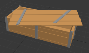
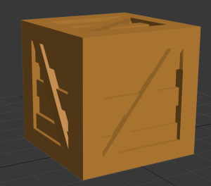
This is how my first crate turned out! The idea I had when I decided to make a medieval crate was to make a crate entirely out of ”wood”, this is the reason for the plank-like structure on each of the 6 sides of the crate. When looking at crates in games with medieval themes, I looked at fable & skyrim.
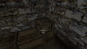
fablecrate Skyrim crate

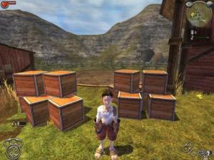
Looking at the ones from fable, I got the horizontal planks on each of the sides, this looked a tad bit boring to me and border on being too perfect. Looking at crates from Skyrim, I got the idea of putting the diagonal planks across the crate on each side (I know the skyrim one does not have them on each side, but I wasn’t trying to make it identical either!). The reason why these games fitted as examples for me was because I have spent far too much time in both of these worlds and the medieval themes are obvious in both of them.
2. Post apocalyptic

Post apo

When creating the post apocalyptic crate, the idea I had was that I needed to create something that looks half broken, as if it had been put together from scrap metals and put together in a rush. The thought was that ”People in a post apocalyptic world won’t have time to bother with creating a perfectly symmetrical crate.” or something along those lines.
When creating this one I only used 1 game as inspiration, and that game was Fallout.

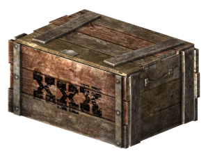
Fallout Crate

From this crate I took a lot of inspiration, with the slightly crooked metal bars on the top along with the slightly different lengths of the boards on the crate. Fallout is set in a post apocalyptic world and is probably one of the most iconic game series with that theme. Everything is dirty and dark, objects around the world are put together using the remnants of the old world resulting in things not being perfectly symmetrical, people in this world make due with what they have left and try to make something that fills a function rather than focusing on making it look perfect.
3. Sci-fi (Urban)

Sci-fi

Now for the one that became a problem for me (as you can see). When I had chosen Sci-fi to work with, I was looking around the room at what others were doing, most of what I saw were sci-fi crates with a ”Future of mankind” type of tone to them, so I wanted to make something different. I wanted to create something alien, and figured I would use Halo’s covenant as inspiration.

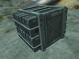
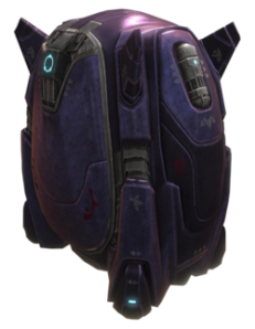
HaloUNSC_CratesHaloCovenant_crate_Reach

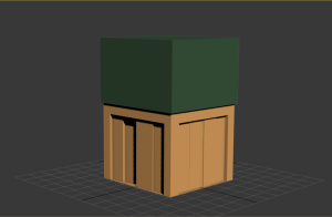
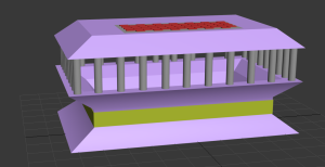
The left one is what I meant when I said ”Future of mankind”, the typical sci-fi style. I wanted something that looked more like the one on the right. At first I had trouble doing this because of a lack of ideas as to how I wanted it to look, so I started playing around with the software and tried to create different shapes. At first I couldn’t get the shapes to curve like I wanted them to, after that I had troubles with creating the smaller details (all this because of a current lack of experience with the software). After struggling to create something that looked even remotely sci-fi or even the least bit like a crate, I had an idea. But as it turns out it was one of those ideas that felt right at first but just turned out terrible in the end. That’s the one I created with sci-fi in mind. In the end it wound up looking more like a ancient Greek temple on a pedestal with checkers on top (the checkers were supposed to be a panel to control opening and closing the crate).

Urban

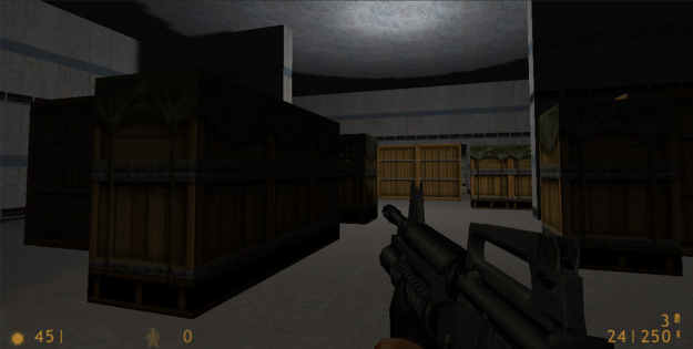
However, due to me being thoroughly unsatisfied with the sci-fi creation. I decided to make a new one with a more urban tone. The game that I took inspiration from is Half-Life. I had a little bid of a hard time finding a good picture of the crate that I used as inspiration but eventually I found this one.

half life crate


The one I’m referring to is naturally the one with the green cover on it. These crates are more urban-like crates but in a sci-fi environment. Now these are the only crates that exist in my mind. If someone mentions crates in games, these are the ones I immediately think of. This is also one of the reasons that makes it a good example to use, it’s a game that most of us have heard about, and a lot of people have played.
I’m thinking about shortening the green cover on top of my crate seeing how it ended up covering nearly 50% of what I did, but the upper half is practically the same as the bottom half of it.

One thing that all three of the wooden crates have in common is that I made the plank sections uneven, I did this to make the separate planks of the crates more obvious, this might have been something that would have been better to do with textures on the urban & medieval one.

Board game analysis: Smallworld

When we started this assignment we had an array of board games to choose from, after some brief consideration (since no group member had an extensive knowledge of board games) we decided to just pick one that looked fun, and that game became Smallworld.

Smallworld is a strategy game with small similarities to Risk. The goal of the game is to gather coins and at the end of the game (after 9 turns or so, depending on the amount of players) the player holding the most coins wins the game. The way the player acquire these coins is by holding ”regions” on the board and at the end of the turn you collect coins based on how much land (regions) you control. There are however factors which can increase the amount of coins a region is worth, these come in the shapes of ”Races” and ”Special powers”. For an example, if the player was to be controlling the Dwarfs, they would gain one extra coin for controlling a region with a Mine symbol on it and if they had the special power ”Merchant” they would gain one extra coin for every region under their control. Should the player run out of soldiers to put down on the game board, or simply lose interest in the combination they chose, the player can put the race in ”Decline” allowing them to pick a new race/special power combination.

The picking of races and special powers are to a certain degree random, all in all there are 14 races and 20 special powers, these are randomly put together and at any given time the maximum amount of combinations to choose from is six. The players start with 5 coins each and the first player gets to choose from the first batch of six combinations, these combinations are put up in a row, the first combination in the row does not cost anything, to be able to choose combination number two, you must place one coin on combination number one, to choose combination number 3 the player must put down one coin on the first and second combination etc..
During the first round the players make their initial conquests, starting at the borders of the board, to make a conquest you need to put down two tokens plus 1 token for every enemy token present in the region.
The combinations of races and special powers would be one of the games primary strengths, since every time you play it could look vastly different when looking at what each player could be able to do. The combinations of the races and special powers also give players more reasons to play the game several times, since when you play the game you constantly come up with combinations that you would have liked to see in play.

The special powers and races can also make it very hard to tell which player is in the lead (the value and amount of coins each player possess is hidden) since a player who owns 3 regions can gain similar or even higher amounts of coins every turn than a player who owns 6 regions, depending on what combination of Race/power they control.

The ability to choose new combinations also allows players to easily catch up to each other, so being in the lead in the beginning might not be all that significant.
An example of this would be the first time our group sat down and played the game. After turn one had passed one of the group members had lost all but one of her regions, and the player responsible for conquering those regions was in control of essentially half the board. This naturally drew the attention of the other players who started focusing on stopping the player who appeared to be in the lead. In the end, the player who had sat quietly in his corner of the board, waging practically no wars while holding a relatively small amount of regions, ended up winning the game, being in possession of around 110 coins, with the closest competition ending at 76 coins.

The combinations can at the same time end up being one of the games weaknesses, since it is a strategy game some players might not enjoy the random element of the combinations since they can, at times, end up being insanely powerful. An example of this is the second round we played of the game when one player held more or less half the board for half the game due to the combination he picked. The race he had (sorcerers) enabled him to conquer 4 enemy regions every turn without having to fight, instead he could simply replace 1 enemy token with a new one of his own. This made him very difficult to attack since it was very difficult to attack without leaving at least one weak point in the defense enabling him to quickly reconquer the territory he had lost.


The target audience

The game is recommended for people of age 8 and up, however I do not think this is a correct target audience for the game due to its complexity. I would say that the game would probably do better in a group of players aged 15 and up seeing how there are a lot of rules and different tokens to keep check on.

The game box includes:
* Several different boards that are used depending on how many players there are.
*14 Races and 20 special powers.
*Cheat sheets that briefly explain how the turns are supposed to be played out and explain the different abilities granted by the different races and special powers.
*Plenty of the 4 different types of coins valued 1,3,5 and 10.
*Mountain tokens that represent the extra “defense value” of mountain regions.
*Several “lost tribe tokens” that work like a regular enemy token, except that they are scattered around the board from the start of the game.
*Several different special power tokens that are given to players with the special power that is connected to said tokens.
*1 Turn token that is moved down the turn counter every time all players have finished their turns.
*A more extensive rule book that explains all the rules and special cases (which can appear when specific special powers or races clash).
*Tokens (or units) for every race.

For our group at least, all these rules and powers where hard to keep track on at first, which can make the first round of the game take a long time. To make it easier on the group we skipped reading the rule book and watched a tutorial instead, this tutorial was about 20 minutes long and explained everything we needed to know (more or less) to start playing. After having tried to understand the rules and eventually having played the game a couple of times, my conclusion is therefore that people ranging from 8-12 years old would probably not have that much fun with it.


What I said to be both the strength and weakness of the game is also (according to me) the most interesting system in the game. The way that special powers work together with the races and how those two put together work with the board and other combinations.
To give an example of what makes this so interesting I will put together a few combinations that are incredibly interesting.

Example 1: Decline combo
Race – Ghoul
Special Power – Spirit
The Ghoul ability allows the player to put his/her race in decline while still being able to move, conquer and reinforce them, as if they weren’t in decline.
The Spirit ability allows the player to keep the race it’s combined with to remain in decline without counting towards the maximum of 1 race in decline at a time.

Example 2: War combo
Race – Triton
Special Power – Commando
The Triton ability allows the player to conquer regions bordering to a sea or lake with one less token (although there is always a one token minimum for the conquest).
The Commando ability allows the player to conquer regions with one less token (same restriction as above).

Example 3: Coin combo
Race – Human
Special Power – Merchant
The Human ability grants the player one extra coin for every farmland occupied.
The Merchant ability grants the player one extra coin for every region they control.

Example of a clash between abilities:
The Sorcerers allow one adjacent enemy token to be replaced (and killed) by a sorcerer token. The Elves never lose a token when conquered, and instead always retreat to a nearby friendly region.
When these two abilities clash, the elven region is lost and a sorcerer token is placed, the elven token however is not removed, but instead placed in an adjacent region.

The list of these types of examples could go on for a very long time, in fact, with the races and special powers available without any expansions, there are up to 280 possible combinations of special powers and races. This makes the cheat sheet very handy since it would probably be nigh impossible to keep track on all of these powers and special cases without it.
Looking at the contents of the expansion packs, it is obvious that the creator also knows this to be the most interesting thing about the game since they (if combined) add 13 extra races and 12 extra special powers.


Summary

The core game system revolves around choosing the right Race/Special power combinations, conquering regions on the board and knowing when to go into Decline in order to change combination. At the end of every turn you gain coins (which are the victory condition) depending on how many regions you control. The player with the most coins at the end of the game wins.

The biggest strength of the game is the amount of combinations that are available and how much of a replay value it gives the players. A large portion of what makes these combinations a strength is that they act so differently from each other.

The biggest flaw of the game is that it’s very hard to become “good” at the game, the only thing you can really gain is knowledge of what combinations you need to be afraid of. This results in a (at times) very unstable game where skill is not as important as luck. The entire game can be completely changed because one player happened to get a combination that could be considered “overpowered”. This flaw however, is not always obvious since it’s possible and often likely, that more than one player gets a combination of that caliber. Because of the random element the game is probably better played if you don’t have the expectation that it will be a fair game. The game rules can also seem like a lot to go through and may scare off players at first glance, but once you start to get a hang of the rules of the game it is a lot of fun and slowly becomes easier to understand as you play it through.

The most interesting system in the game is how the race/power combinations can work together on the board and sometimes against other combinations.

Even though we started doubting that Smallworld was the right choice at first, we ended up having a lot of fun with it!
Analysis of Screenshots & 3D Level

Batman

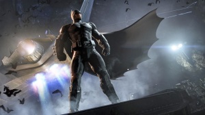
The first Screenshot to analyze was this one, a picture of batman in a cave with (presumably) the batplane behind him. The first things to take note of in this picture is the tilt and perspective of the picture. The tilt and the diagonal lines in the picture are there to emphasize movement or mobility in the picture making it a ”action” shot. The vertical lines and the perspective are there to emphasize the power of batman, standing on a height looking tall and powerfull.
Batman is made with distinct edges and sharp shapes to make him look threatening. The lighting and coloring of the picture is low key and, apart from smaller areas in the picture, black. The main colors of the image are blue and around the lights green. The color and lighting put together gives off a small sense of sci-fi. This also goes for the textures, everything in the picture is very shiny and reflects plenty of light.


battlefield_hardline

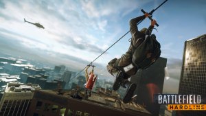
The second screenshot is of Battlefield Hardline. The picture is made up of mainly diagonal lines to emphasize the movement in the picture, that being the 2 people going down a zipline with money falling out from the orange backpack. The money is blurred to also further emphasize the speed of the action in the picture. The picture is high key with blue being the most used color in the background, this is probably to increase contrast and to draw more attention to orange backpack of the person furthest down the zipline.
The textures are very shiny, to me this can look strange when the textile on the characters going down the zipline are shinier than the black glass building to the right of them.


Mirrors-Edge-2

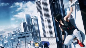
The third picture is of Mirrors Edge. Composed of vertical/diagonal lines to strengthen the greatness of the city and to show that the picture is not static, again, showing movement. High key lighting with very little color, most of the city is made up of blue and white to place it in a sci-fi world. The main character in the image is different, she has black, white and red clothing making her pop out from the environment around her. All in all the city is made very shiny, it almost looks like the entire city is made of glass, this is to further emphasize the sci-fi elements of the world.


The-Witcher

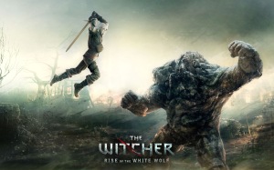
The fourth and final picture is of The Witcher. The picture is made up mainly of horizontal lines, these are usually used to give stillness and calm to an image, in this case however it is made to make the dynamic lines of the two characters in the picture even more mobile. The lighting is sort of mid-key, looking at the dark foreground and the very bright bakground. The colors of the characters are dark, putting them at contrast with the very bright background.


Part 2

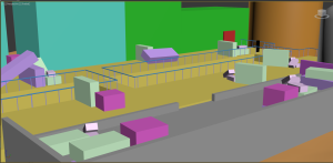
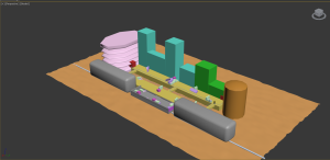
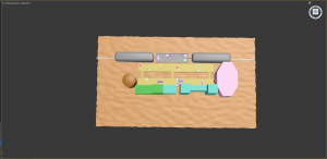
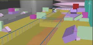
Level2 level3 Level5 Level4 Level6

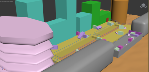
For the assignment to create a level we were given the choice among 3 games and a few feelings to try and convey through the level. The game I chose was Mass Effect and the feeling to convey was Danger.

When I think of Mass Effect I think of a couple of things: Space, indoor environments on spaceships/space stations and one of the earlier levels of the game. The level that popped into my head was the one that’s played out on a train station.

So in order to try and convey the right setting to be able to give the player a sense of danger, I started creating the walkways that the player will have to traverse. I made them wide to leave space for ”crates” and other sorts of cover for the player. I gave the buildings these colors to keep track on separate buildings, the green one is the starting area of this part of the level and the pink building is the goal. I put down the red ”doors” to highlight the beginning and end, just to make my thought process more obvious. To convey danger, I made the walkways narrow and cover less to make the player feel exposed while crossing. I also made the cover face one direction while at the same time opening up the middle section of the train to give space for further threats since it’s placed to give enemies flanking potential.
The area is surrounded by large buildings, the reason why I did this was to make the player appear smaller and trapped, this was also to try and emphasize that the area is not a safe place to be.

Now, if I as a player where to enter an area looking like this, filled with covers and having the walkway where I start blocked off I would immediately assume that I am either about to fight here, or I am going to come back at a later point and have to fight then. Either way the scenario would make me think of the area as a battlefield. The player can see where to go from the start and can also see that the most direct route to the goal is blocked off.


When I showed the level to my classmates they understood what game it was from, however the feeling that I tried to convey was not entirely correct. The reason for this, I believe, would be that the level itself could convey more than one of the given feelings. The two feelings that the classmates thought of were Suspense and Aggression, in my opinion these words are, in games like this, closely related to danger. Aggression was guessed due to the covers and the fact that in an area looking like this you are going to have to fight, hence you will have to be aggressive. Suspense was guessed, also due to the covers since you are faced with a situation where you could fail.
Because of this, I would like to think that I managed to convey my thoughts pretty accurately and my classmates understood my thought process as well.


Looking at their creations, most of them where of the game journey and used the keyword Solitude. This struck me as an obvious choice, this was also the reason why I chose not to do journey or solitude. It was obvious since Journey is a game that goes very well with the word solitude you are (for the most part) alone in a big empty dessert with large ruins. Even when you are not alone (when another player joins) you are still alone, you are just alone together.
The most used art of element in these pictures where vertical lines to make the world feel bigger than yourself, this also contributed to the feeling of solitude since in spite of all of these large structures, you are still alone.

Guard mock-up among other things

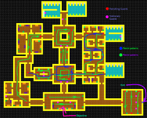
This weeks blog post is the most difficult one to do so far and I couldn’t find any image to properly depict my work, so the picture below is the mock-up of how the guards will patrol the building and it also shows where the objective and exit. The reason behind this week being hard to post about is that alot of what I’ve done has been adding in new sprites and testing them out against our floor and the rest of the sprites.

Patrol paterns

The largest thing I‘ve done was when I added in the furniture for the ”Break room” or cafeteria and some of the furniture for the final area, the ”front desk” of the building. When we have a new build of our game I will probably have to change around some of the guard patrolling patterns, maybe remove some guards and perhaps even changing how parts of the level are built. The issue with building levels the way we do it is that when I’m building it, I have a really hard time figuring out how things will look in the actual game, since the color codes are purely representative and remain as colored squares until added in the game. This is also the reason why a lot of the work I’ve done is hard to put into pictures, since my work has essentially been: Add in new floor. Doesn’t work? Change it back. And it’s been a lot of these tests, with plenty of different values on furniture and so forth, to see if they would even be visible in the game.

Today (Thursday) has consisted largely of testing out variations of floors, we have had a lot of floors that plainly look strange, some that blur out when the player moves around and a few potentially useful ones. We tried a plain one, without any sort of patterns and that ended up looking… Plain. All the ones with smaller patterns were safe to scrap immediately since these always cause the illusion of the floor moving around.

Anyways, this weeks blog post ended up being more boring than ever before, I’m sorry for whoever might end up reading  this one… Hopefully next weeks blog post will be far more exciting since we will have a better AI and a fresher build of the game to play around with and when we do, I will get back to play testing and balancing the entire level (mainly the middle route though which is insanely hard by the looks of it).

Explaining the ”Noise maker”

NoiseMakerExplanation

This week I’ve been working on completing our design documents since we got a few comments on our first hand in.
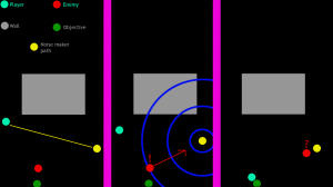
The picture above is the image I made to briefly explain how one of our usable items will work. The Item I’m referring to is the ”Noise maker”. This item is meant to be a none-violent alternative to the rest of the players arsenal. It’s supposed to be a single use item which emits sound circles that will draw away guards from their original position/patrol path.

The sound circles are used in almost every step of the game, walking around creates smaller sound circles, sneaking removes them, using weapons (especially the gun) creates larger sound circles and the noise maker creates circles equal to the gun. These circles represent the sound made by everything in the game and helps show the player from what distance guards will hear the sound and go to investigate.

What the image above represents is:

The first image depicts the player seeing an enemy guarding the objective and throwing the noise maker to the opposite side of the room.
The second image shows an example of how large the sound circles emitted by the noise maker could be, and also shows the guard hearing the sound and starting to move towards the source of the sound.
Lastly, the third image shows the guard standing by the noise maker, investigating, while the player is able to sneak past towards the objective unnoticed.

Other than what I’ve explained above, I have also worked on other things for our design document, mainly a few minor corrections that needed to be made and further explanations of some specific things. I also made a quick drawing showing the movement patterns of our patrolling guards, as well as marking out the objective and exit. It had to be done since we previously had no visual explanation of how the level looks or what the guards potential moving patterns might be.

Just today (Thursday) I also had to continue working on our level, adding in new objects, trying out revised environmental sprites, now made to look darker, to better fit with our visual aesthetics. Previously the game was far to bright to be able to be taking place during night time.

All in all this week has consisted of a lot of smaller tasks put together, becoming time consuming. As soon as we get our AI’s to work properly I will probably have to rework the guards patrol patterns and positioning to make it more balanced again.

Rotating & vanishing Guards

Blogg_Screenshot


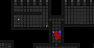
Okay! This week has been a very interesting one! I have been further working on our level design and have been adding in rotations to our stationary guards. I also had to remake all of the patrolling patterns for our guards since there was some issues with how the guards spawned in comparison to where they wanted to patrol. I solved the patrolling guard issue quite easily, it was just a bit of tedious work on it to get it working properly. The rotation of the stationary guards was, for me, difficult in the beginning and ended up being a bit of a guessing game since I had no idea how to do it and the programmers had a hard time remembering how they did it. The main problem I had with it was this: I had to write the angle of which the guard starts rotating from and the angle where it turns and starts rotating back again. The guard in the picture for an example rotaded 270 degrees to 90 degrees. The thing I found to be most complicating about this was to make him rotate on the right side, to make this happen (if the guard didn’t rotate towards the hallway, but instead straight into the wall) was to simply flip the order of the angles in the document. I think I probably managed to make them rotate the wrong way every time and didn’t do it right from the start even a single time… But anyways, easily solved!
When fixing the patrolling guards we also encountered a minor issue where the guards couldn’t be spawned in the exact location that they where meant to be patrolling. Also a minor inconvenience that was easy to fix but still took some time to fix up properly.
Later in the week we started getting more features in and I had to start using the newer version of our game since this one was dated. We had added in more weapons, animations, the new sprites and so on. This is when the issues began. Patrolling guards began disappearing from the map, and we had no idea why. The vanishing of guards followed no specific patterns at all, it all happened completely at random. Later, started adding in sounds aswell, it all worked fine, until it suddenly just stopped working. Partially atleast. The gun stopped making sound for all of us except for one. All the issues we had, stopped happening on one of our computers. The owner of this computer uploaded his version of the game but it still isn’t working on the rest of our computers.
At the moment we have no way of fixing it, since we don’t know what the issue is. But that is for the programmers to find out!

Level Design

Level Large

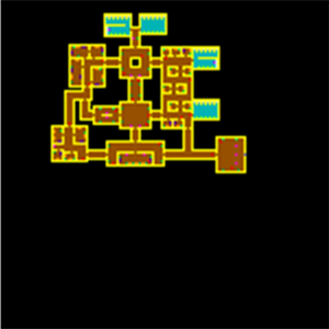
So this week I have been working on our level drawing and I must say it’s a lot of fun! Now I know that unfortunately you can’t make out everything that’s on the map, but for those of you with keen eyes, I can quickly explain what the different colors in the drawing means.
The way we create our level is through color coding, this means that for us to create the level we draw out different colors and each different color code represents an object. A few examples of the most obvious ones in this drawing would be yellow, brown and lightblue. Each pixel that has yellow drawn on it will represent a wall, each pixel with brown will represent floor and each pixel with lightblue will be bathroom floor.
Some of the less visible ones are red for patrolling guards and light purple for stationary guards, there is also different varieties of green representing hiding spots in different angles. Some of the things that we are still missing in this level drawing would be filler objects with no particular function but that will fill out the level and make it look better.

So, about the level design itself: The player will start in the top left bathroom (this will probably be flipped upside down, making the player work his way up the level instead of down) where he/she will be briefly introduced to the game. This starting area is made so that the player is quickly shown all (or atleast most of) the mechanics in the game. The bathroom has a wall separating the position of the player and the first guard which will be turned towards a urinal. When the player moves he will have no choice but to move towards the first door, this door however will be locked, forcing the player to seek out a way to get around this first obstacle. At this point you will notice a guard with its back turned towards you, when you have killed the guard you will receive a keycard enabling you to unlock the first door. Immediately after leaving the bathroom there will be a stationary guard scanning up and down the hallway, the only way to get past the guard is by using the conveniently placed hiding spot right across the hallway from the guards position. The controls will also be explained in a subtle way which is too early to be writing about now, since we are not yet entirely decided on how it will be presented.

After the first area the player reaches a hub-like area where three choices of paths will be presented to the player. There is the left path, which will take the player on a slightly longer, but not as security heavy area leading up to the main office (or objective room, currently placed at the bottom). The right path will be a slightly shorter path to the objective room and will eventually place you in a hallway between the exit and the objective room, the right area will also have slightly more tricky guard patterns than the left path. And lastly there is the middle path which will be the shortest and most direct route, but nearly impossible to get through due to security. The way these choices will be presented in the hub area are:  The door leading to the left path has no guards around it and will be unlocked. The door leading right will be locked but still has no guards around it. And lastly the door taking the player down the middle area will be heavily guarded and with a locked door.

All this is made so that the player has a choice of play style, and since we have a time-based score system the player would have to choose (after having tried a couple of games) which path will be the most time efficient to the way he/she likes to play.

That’s it for this weeks post, I hope it’s in some way helpful or at least interesting to whoever ends up reading it. I also hope that it wasn’t long enough to boor you!

Bathroom Sprites

Pissoar_alt2 Sink_alt3test Toalett


Right! So this week I started working on some environmental sprites. What we have to the left is a urinal, in the middle there’s a sink and to the right is a toilet. The reason why I needed to start working on bathroom sprites was because the area where the player is supposed to start in, happens to be a bathroom.  This bathroom is going to act as the introduction to the game for the player and will have some form of tutorial like function. The idea we have for this part of the level is that the player is going to start inside a bathroom stall, which he will exit by pressing ”E” a hint will be given as to what the player is supposed to be doing aswell. After having exited the stall, the player will be given a new hint, telling the player to press the space bar, what the player will than notice is that he’s moving slower and stops making noise. After that, the player is lead around a corner where an idle guard will be standing in front of a urinal with his back turned towards the room. The player will be given a hint as to how to attack, and since this guard has his back turned, he will be an easy target so long as the player uses what he/she has learned. When the guard dies, the idea is that we are going to show the player how to use keycards. The door exiting the first area is locked, but the player has obtained a keycard when killing the guard. This keycard will be used up once the player uses the ”E” button in front of the door, the door will open up and the player is let out.
Now, I know these objects would be black and white either way, but there is a reason why I can’t put any color on them at all. The reason would be that our game is made in black and white, only objects of interest and things the player can interact with will be colored. This is in accordance with the graphic style we want for the game, and while its very tempting to put in one of those tablets in the urinal (which I did) I wouldn’t be able to color it, making it very hard to notice (as you can see). It will probably be invisible to the player in the end, but it felt good to add it in anyways. It simply didn’t feel completed without it!

Thats about as much as I have to say regarding pixeled bathrooms in a game for now!

The baton of Futura

Baton

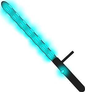
This is the baton icon which will be represented in the interface when the baton is wielded. The idea behind it, as with all the weaponry and objects, was to take something old and make it new while still keeping the old feel. We did the same thing with the gun we designed for the game, we took an old revolver and made it more futuristic. Doing so with a baton is difficult because there isn’t a lot of room for varied details since it’s just a stick. So what did I feel would make a baton look more futuristic?
Well, the first thing that came to mind was some form of light, when doing this you also create an opportunity to add something to the handle, such as a button to control the lights. Secondly, when deciding on what color to use for the lamps, I felt like a neon type of light would be best suited. The reason for this is that when adding a light with a color like this it makes the baton look more harmful if it to come in contact with your body. It makes it look like a stun baton or something of the sorts. Seeing how the gun uses a sort of ”plasma” type of projectile, I figured the baton could go with the same theme and that’s the reasoning behind the color. The lights in the baton also makes it look more like a weapon by not giving it a smooth surface. The lamps also works with logic since they are carried by night-shift guards, an extra light source would be a welcome addition the their arsenal.

The weapon itself will act as a direct upgrade to the standard weapon which is a Garrote, the baton will be both quicker and more silent than the standard weapon. Both the Garrote and Baton will have activation times, making direct combat undesirable, encouraging stealth. It will also act as a middle stage of weaponry and being a all round good choice, the gun has range, but you are able to miss with it and it makes a lot of noise, attracting guards. The Garrote, being your standard weapon will be slightly worse at everything and the Noise Maker does not have an offensive function but only acts as a distraction/maneuver item.

The power-ups will naturally undergo balancing once we get to that point, but for now this is what we are working with!

Beginning of a new Project

The game concept we chose to work with was the game ”Escape”, the way we started out was by having a meeting regarding the features we felt like removing as well as what we wanted to add/change. This meeting went down smoothly and we appeared to agree on most parts. We also decided to start working with the design document straight away, and this time around we figured we wanted this done as soon as possible, so we decided to split up the document into smaller parts and hand out segments of it to each group member. We also decided to try and have as much of the document (preferably all of it) done at the end of the first week. After the Thursday lecture on scrum we marked these parts (as well as some art & code tasks) into artefacts in our scrum doc. At the end of the week we went through what everyone had written to check their coherence. We had to adjust parts of each documents, but seeing how parts of the group got more demanding tasks we extended the Estimated Work Hours on some of them. All in all we are off to a decent start, even though one of my artefacts (compiling the design document) was impossible for me to complete since we extended the deadline on parts of it.